Create your first theme
Set your organization’s colors, fonts, corner radius and spacing once, then every dashboard, journey, survey and layout can inherit them, live.
Creating and editing themes requires the Editor role or higher. Making one the organization default requires Admin.
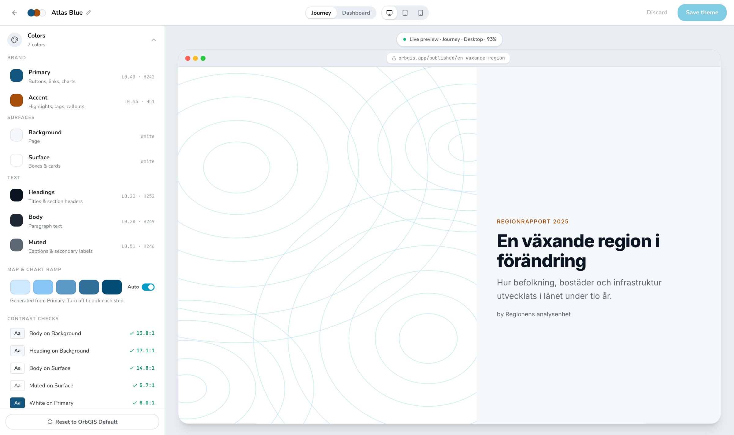
Create the theme
Open Tools → Theme Builder and press New theme. A new theme starts as a copy of OrbGIS Default. The built-in theme itself is read-only, open it and the builder offers Duplicate to edit.
Set the two brand colors
Under Colors → Brand, pick Primary (buttons, links, chart series) and Accent (highlights, tags, callouts). Everything else derives from these unless you override it.
Set surfaces and text
Background is the page, Surface is boxes and cards. Headings, Body and Muted are the three text colors. Each swatch shows its lightness and hue, so you can keep a family of colors consistent.
Check the contrast
The Contrast checks list scores seven real combinations, body on background, muted on surface, white on primary and so on, against the WCAG ratios. Fix anything flagged amber before you save; the preview also shows a Low contrast pill while a check fails.
Tune the map and chart ramp
The five-step ramp is generated from Primary and drives graduated map symbology and chart series. Turn Auto off to pick each step by hand.
Choose type
Under Fonts & sizes, pick a Default font from the catalog or upload your own (
.woff2,.woff,.ttf,.otf, up to 5 MB). Then set the six text styles, Heading 1, Heading 2, Heading 3, Paragraph, Caption and Button, each with its own font override and desktop size. Tablet and mobile sizes are calculated from the desktop value until you type over them.Set radius and spacing
Border radius runs from None to Extra and applies to dashboard boxes, buttons, cards and journey map frames. Spacing sets the gap between elements, from Smaller to Very spacious.
Watch the preview, then save
The right-hand pane renders a real journey and a real dashboard with your theme, switch between them, and between desktop, iPad and mobile, at the top. When it looks right, press Save theme.
Putting the theme to work#
- In a dashboard, journey, survey or layout, open Design and pick the theme. The item stores a snapshot and the theme id, so editing the theme later restyles everything using it.
- Leave an item on Org default and it follows whichever theme an admin has marked as the organization default (the Set as org default action in the theme list).
- Need one item to differ slightly? Use Overrides in the same panel, a per-item tweak to a color, the font, radius or spacing, without forking the theme.
- Admins can also apply a theme to the portal interface itself: Admin → Settings → Portal Appearance.
Themes are shared across the whole organization, and editing one takes effect immediately everywhere it is used, including on published pages. Duplicate before experimenting on a theme that is already in production.