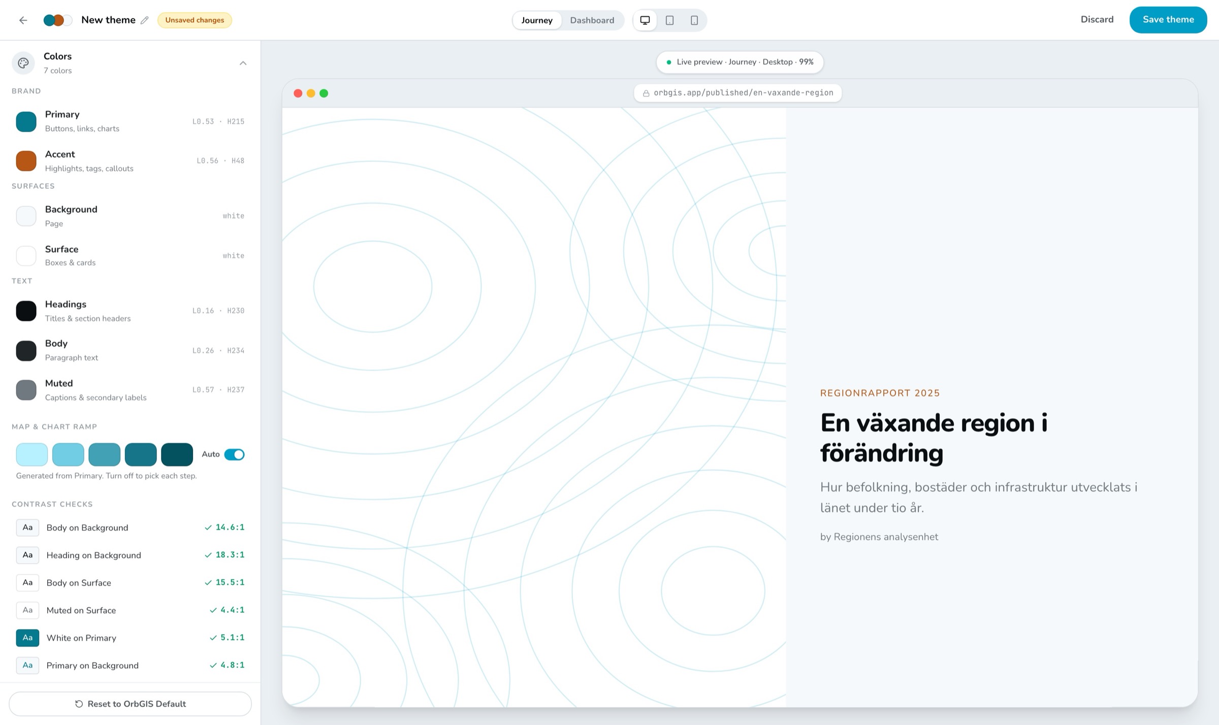
The builder, your colors on the left, a real Journey on the right
Seven colors, six text styles, one spacing slider. Every dashboard and Journey in your organization picks it up, while editing, in preview, and published.
The builder, your colors on the left, a real Journey on the right
A theme in OrbGIS is deliberately small: seven colors, a five-step color ramp for maps and charts, six text styles, corner rounding and a spacing scale. Everything else, borders, separators, text on buttons, the chart palette, follows from those choices. You can't forget to style something, because there's nothing left to forget.
The builder previews your theme on the real thing: an actual dashboard and Journey filled with sample content, exactly as they'll look published. Flip between desktop, tablet and mobile. And as you pick colors, OrbGIS checks that your text stays readable against its background, and tells you what to fix when it doesn't.
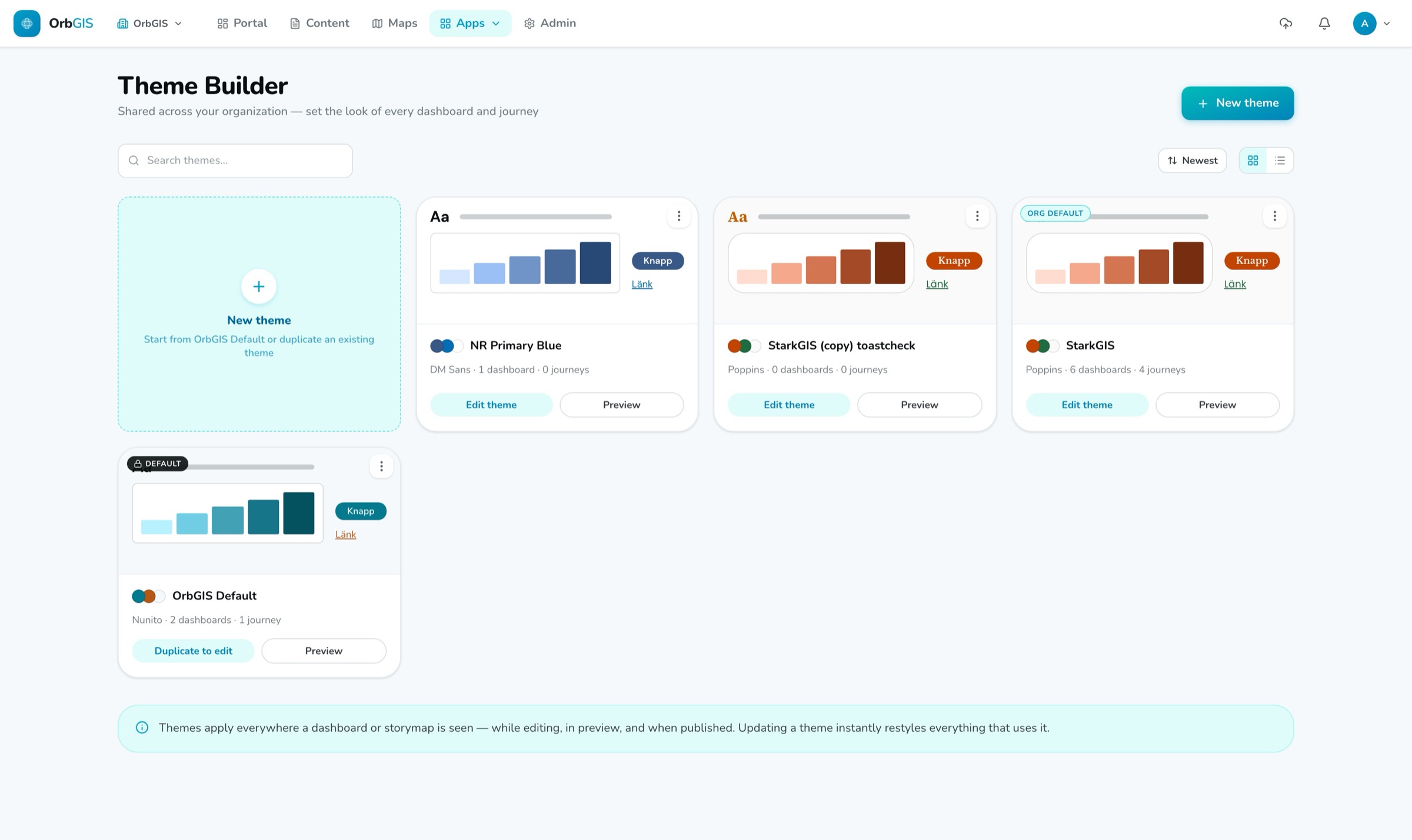
Themes live in a shared library for your whole organization. Update a theme and everything that uses it follows, published pages included. Items without a theme follow your organization's default automatically, individual items can override a color or font without leaving the theme, and an admin can even point the entire OrbGIS interface at a theme, pick a dark theme and the whole portal follows.
Primary, accent, background, surface, heading, body, muted. Borders, separators, button text and the chart palette are computed from those, so a theme can't half-apply.
The preview shows an actual dashboard and Journey filled with sample content, on desktop, tablet and mobile. What you see is what publishes.
OrbGIS continuously checks that your text is readable against its background, and points out which color to adjust when the contrast gets too low.
Six text styles, from headings to buttons. Set the desktop size and tablet and mobile follow automatically, or take over and set them yourself.
The five-step ramp for maps and charts is generated from your primary color and used automatically. Prefer to hand-pick the steps? Turn Auto off.
Twelve fonts to choose from, or upload your own. Uploaded fonts travel with the theme, so public visitors see them too, no extra setup.
An admin can point the entire OrbGIS interface at a theme. Pick a dark theme and the whole portal follows, readable and consistent, not broken.
Set your organization’s colors, fonts, corner radius and spacing once, then every dashboard, journey, survey and layout can inherit them, live.
→Design your organization’s look once, colors, fonts, chart ramp, radius and spacing, and every dashboard, journey, layout and survey inherits it.
→The Admin area is your organization’s control room: overview statistics, members and roles, invitations, an activity log, and the settings that apply to everyone.
→
No demo call. No sales funnel. Sign up to make your first map.